Graphic Design Portfolio
Click on an image to learn more about our different graphic design projects!

The Form Designs Graphic Design team created the logo for My Magic Tunnel with the product objective and target audience in mind. We concentrated on designing a logo that would be versatile and appealing to children by utilising simple shapes and incorporating bright colours to create a legible, fun and captivating logo. This quirky logo combines fun, bright colours with added perspective and dimension. The personification of the train helps to aid in engaging with its intended audience as well as directly relating to the physical design of the product.

The Logo for TAGLINE TERMINATOR has been carefully developed to reflect the brand’s core values and vision. It consists of the logotype “TAGLINE TERMINATOR”, a Tagline Tool Kit in upper case and is accompanied by the TT graphic surrounding the logotype.

The Corporate Logo for Hot Teaze consists of the “HOT TEAZE” bold logotype, the “HAIR REVOLUTION” regular logotype and the “htz” logo symbol above the logotype. This logo resonates with that of the industry and helps portray the hair accessory as an innovative competitor in the field.
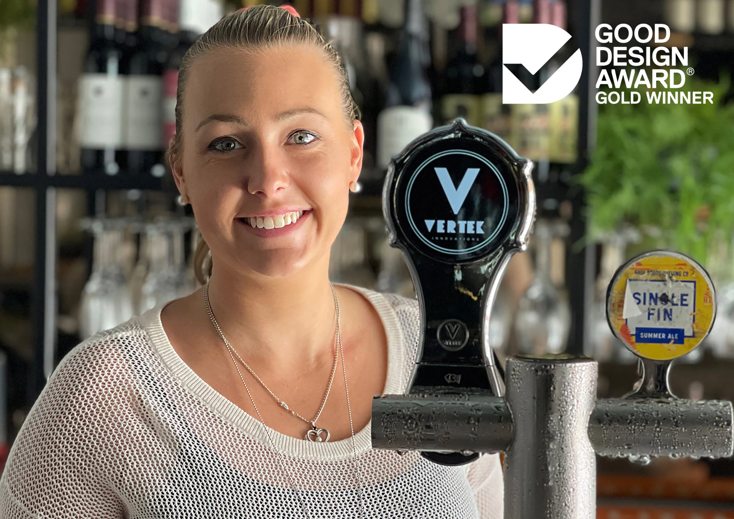
Vertek is a water tight electronic device with special cabling designed to operate in hostile conditions carefully thought out and appropriately sized to be fitted to the beer dispensing taps as would be with a standard decal advertiser. The difference being a modern advanced advertising medium, never seen before in these environments.

The client approached Form Designs Australia seeking a distinctive logo for their fire-starting product, Blazaball. They wanted a design that was both simple and effective, capturing the essence of the product. Our team developed an iconic logo featuring bold text with flames integrated into the two "L"s, symbolising the fire-starting functionality. The result is a visually striking and easily recognisable logo that reflects the innovative nature of the Blazaball.

For the Flex 2 Flow brand, we conceptualised a name that reflected the product's core functionality—flexibility and smooth water flow. The corporate logo for Flex 2 Flow consists of the “Flex 2 Flow” logotype and the stylised water spray represented by the 6 blue coloured “squirts” onto the lawn represented by a top half circle in green.

For the Clothe It Hanger branding, we created a logo that visually represents the product's unique functionality of closing and opening. The design features a dynamic illustration of the hanger in action, complemented by elegant, flowing text that captures the essence of convenience and modernity.

The client engaged Form Designs Australia to create a logo and graphic identity for Bogabox that reflects its dual-purpose functionality and outdoor focus. They wanted a design that would appeal to adventurous consumers, emphasising durability and practicality while capturing the essence of outdoor living.

The Logo for Saru has been carefully developed to reflect the brand’s core values and vision. It consists of one typographic element. This Logo is a purely typographic design, incorporating only the brand name. The typeface is very minimalist and luxurious; values the brand encapsulates.

Form Designs Australia developed a comprehensive branding strategy for Picco Shade, focusing on a logo that conveys luxury and performance within the sporting and golfing sectors. The logo has a yellow silhouette of the brim itself above clear “PICCO“ typography.

Form Designs Australia created the logo for Hair Band Hangout to embody the brand's fun and trendy spirit. The design features clear, bold black and white text, ensuring easy readability and modern appeal. The last 'o' is creatively transformed into a playful bunch of hair bands, visually representing the product and adding a unique touch that captures the essence of the brand. This thoughtful design effectively communicates Hair Band Hangout's focus on stylish and versatile hair accessories while standing out in the market.

Form Designs Australia crafted a branding strategy for BedZee, incorporating a logo that features a playful silhouette of a child sleeping under a blanket, symbolising comfort and care. The design uses soft, inviting colours to evoke warmth and security, appealing to both toddlers and their parents. Marketing materials were designed to highlight the product's features, ensuring a cohesive and engaging brand presence that aligns with the needs of families seeking quality sleep solutions for their little ones.

Form Designs Australia created the Shoppacart logo and corporate branding to reflect innovation and functionality. The modern typography and dynamic design element symbolise convenience and mobility, while a cohesive colour palette embodies sustainability. This approach ensures brand consistency across all marketing materials and resonates with the target audience, making Shoppacart easily recognisable and memorable.

The corporate logo for Uccello Designs consists of 4 main design elements. The first dominating element is the abstract bird shape on the Italian flag colours (green, white and red) as background. The “Uccello Designs” regular logotype also accompanies the logo and all elements are set on a black solid background.

The Logo for RAINBOW BOXES has been carefully developed to reflect the brand’s core values and vision. The logo consists of a symbol and typography. The symbol is the conventional shape of a rainbow. Its uniqueness lies in the fact that the rainbow is actually ‘made’ of a continuous overlapping line representing a ribbon in the colour and shape of a rainbow... with a bow on the top. The ribbon is part of the elements that compose the gift-wrapping kit.

The Corporate Logo for Post King consists of four main graphic elements: the first being the stylised, heavy perspective grey pole, combined with the 3-dimensional axis arrows representing a crown. The logotype “POST KING” is in uppercase above, with the uppercase tagline “HOLDS A POST - LEVELS A POST” below.

The Logo for Sicurifit has been carefully developed to reflect the brand’s core values and vision. It consists of one graphic element and two typographic elements. This logo has been created with different fonts and with the addition of a curved lined to resemble the flick of the duvet cover, to add a point of difference to the logo. The colour palette was chosen by the client.
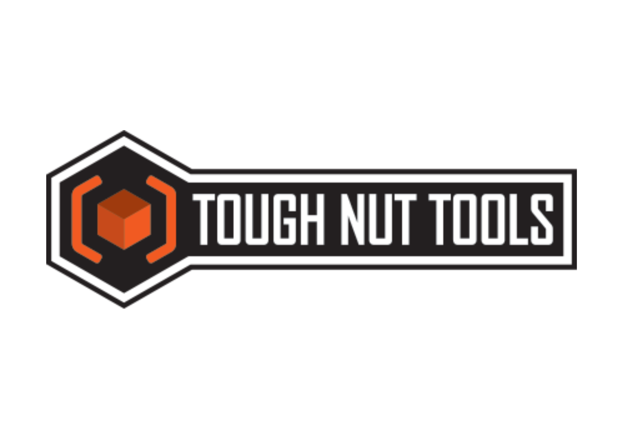
The Corporate Logo for TOUGH NUT TOOLS consists of the uppercase logotype “TOUGH NUT TOOLS” located in the centre of the “shaft” illustrated in black. A three-tone hexagon communicates a sense of three-dimensional view, and a nut which describes the uniqueness of the Tough Nut Tools function. The hexagon nut is also surrounded by two orange brackets which is perfectly offset from the hexagon.

This Logo combines a genie and toilet brush to picture a ‘genius’ toilet brush. The genie brush tail releases two detergent tablets, one at the top end of the brush, the second also combining the dot on top of the ‘I’. Sparks in the background follow the brush passage to symbolise the effectiveness of the product and the cleanliness it leaves.

Form Designs Australia created the logo for the Vet Sled, a mobile horse enclosure, to reflect both functionality and care. The design captures the essence of safety and mobility, using sleek elements that communicate the product's purpose. This branding highlights the innovative solution for animal care professionals and owners.

At Form Designs, we crafted a distinctive logo for the Gilia Kettle that embodies its innovative tilt-and-pour design. The logo reflects the brand's commitment to safety and convenience, featuring clean lines and modern typography. This branding not only enhances product recognition but also communicates the kettle's user-friendly nature, appealing to its target audience.
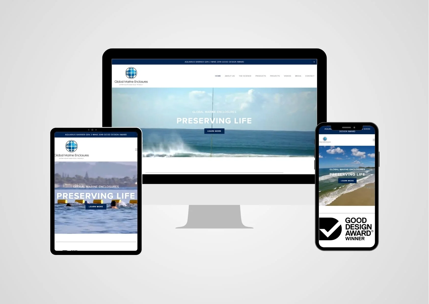
Form Designs Australia's graphic design and UX development teams crafted the Global Marine Enclosures website to be responsive and mobile-friendly, ensuring optimal performance across all browsers and screen sizes. The design prioritises user engagement and education, incorporating parallax scrolling that seamlessly presents information pages to encourage exploration of the innovative barrier technology. A clean homepage with a large feature image and minimal text invites users to scroll for more details, while four embedded feature videos demonstrate the product's benefits, automatically adjusting to different devices for an enhanced viewing experience.
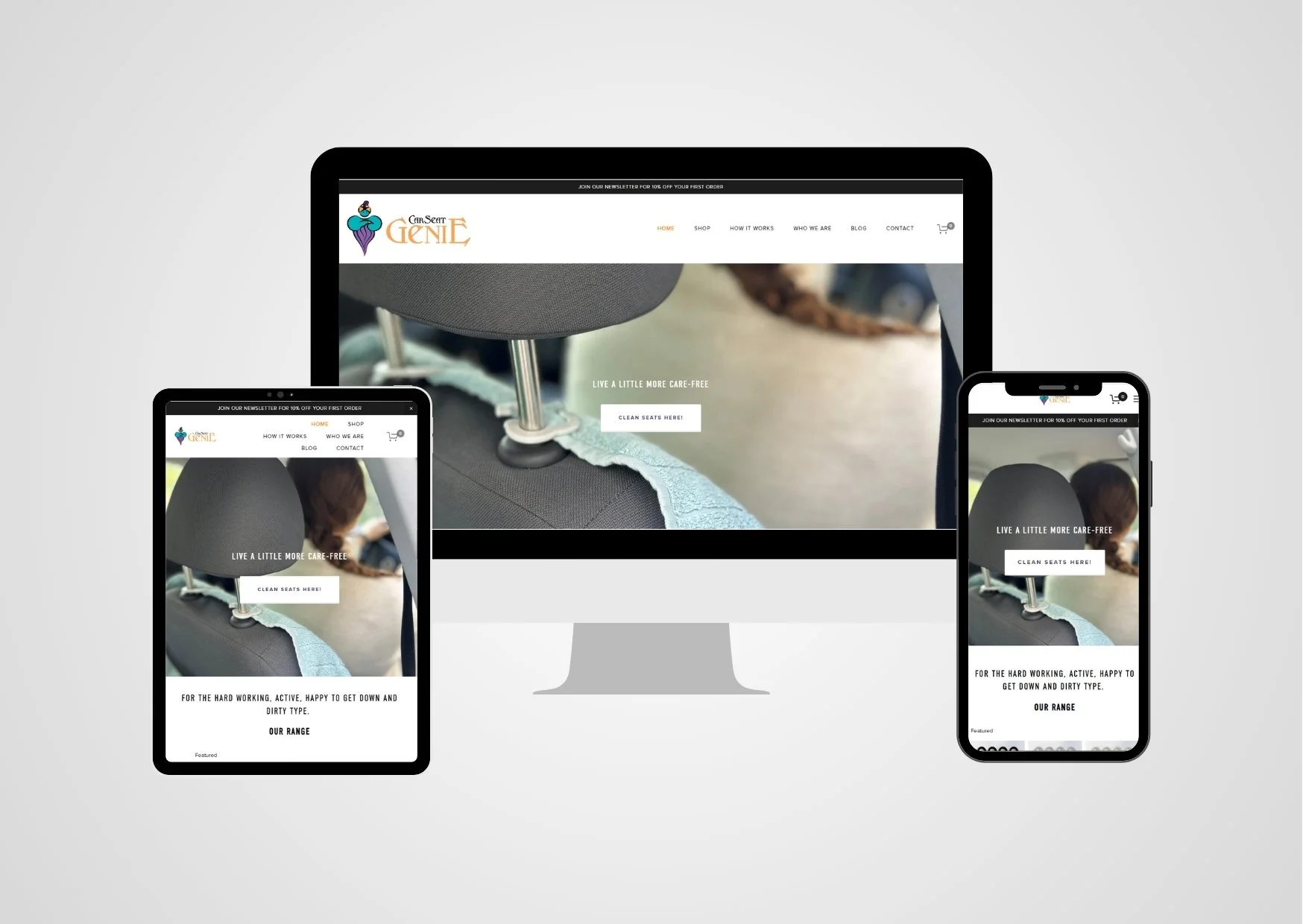
At Form Designs, we developed the Car Seat Genie website with a focus on providing a smooth and intuitive experience for users. The site highlights the convenience and practicality of Car Seat Genie products, offering easy navigation and a clean layout to help customers explore features and make purchases effortlessly.
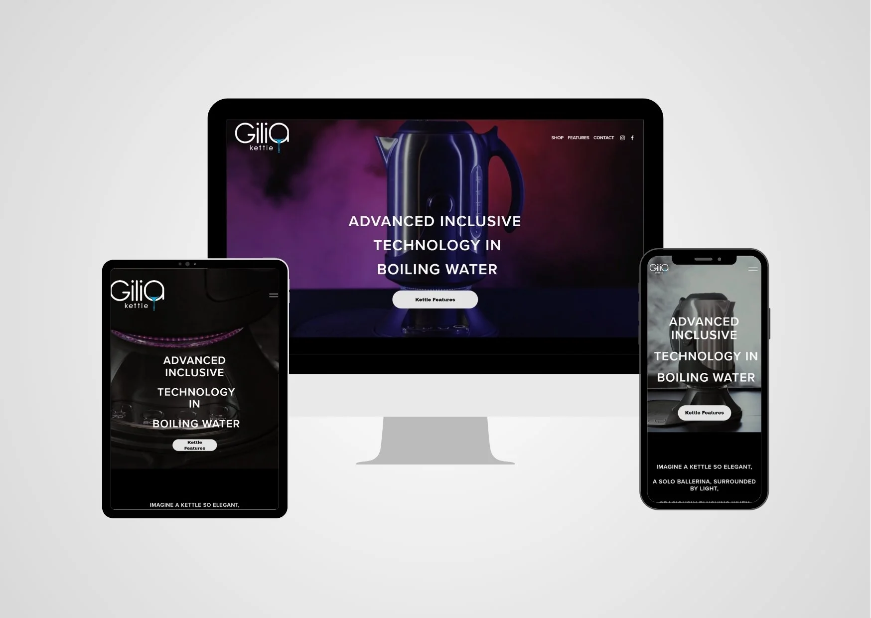
At Form Designs, we developed the Gilia website, focusing on creating a user-friendly, engaging platform that showcases the innovative features of the Gilia Kettle. The site is designed for easy navigation, providing customers with a seamless experience as they explore the product online.

The Logo for Opuverse has been carefully developed to reflect the brand’s core values and vision. It consists of one graphic element and one typographic element. The brand name Opuverse has been designed using a minimalist typeface to convey the brand as classy and luxurious.

For Mummy's Tiny Helper, Form Designs Australia developed a captivating brand identity and logo. The design incorporates two playful children and whimsical typography, capturing the essence of joy and creativity in parenting. This approach positions Mummy's Tiny Helper as a delightful and reliable brand for parents seeking innovative solutions for their little ones.

The corporate logo for Safe T Tag mainly consists of the logotype “safe t tag” in upper case letters. In order to emphasise the product’s safety aspect, a “yellow warning” design symbol has been integrated into the corporate brand. The yellow warning design element has been positioned in the middle section of the logo behind the “T” letter. The whole logo is then bounded by a stylised unplugged electric wire.
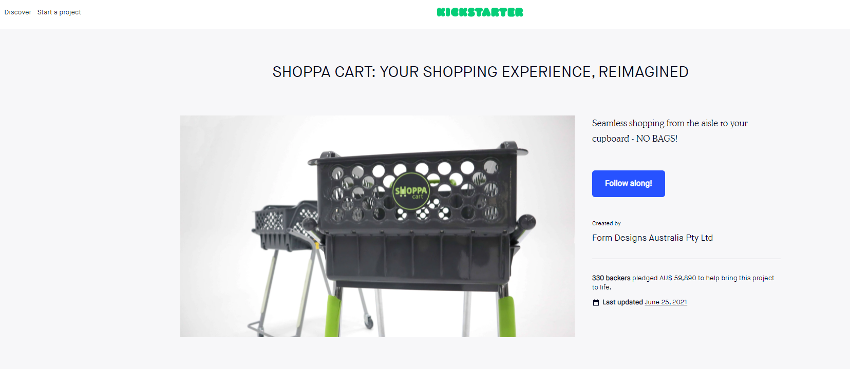
The Form Designs Australia team effectively coordinated the Shoppacart crowdfunding campaign by planning timeframes, costs, and rewards while collaborating with the PR team to enhance visibility. They managed communication through email and social media platforms, including Facebook and Instagram, to engage potential backers and drive interest. Additionally, the team designed the campaign page layout and content, ensuring a seamless fulfilment process by coordinating with the company responsible for managing orders.
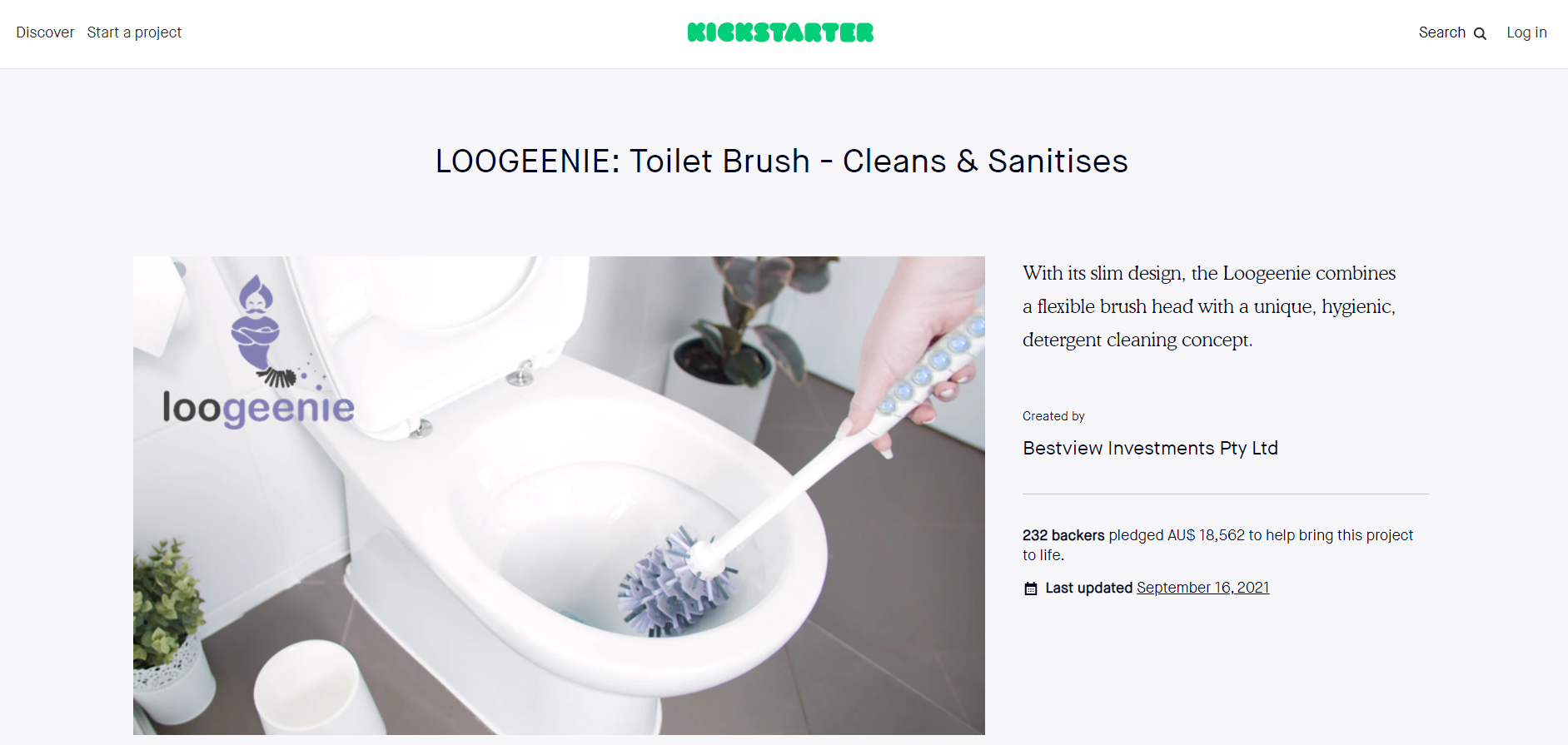
Form Designs Australia played a pivotal role in setting up and managing the Loogeenie Kickstarter crowdfunding campaign. We meticulously planned timeframes, costings, and reward structures to ensure a successful launch. Our team coordinated with PR, managed email and social media strategies, and created an engaging layout for the campaign page, handling both content and text to tell the brand's story effectively. Additionally, we assisted with advertising efforts and partnered with a fulfilment company to streamline order management, ensuring a smooth and organised process from start to finish. This comprehensive approach helped set the stage for a successful crowdfunding effort.
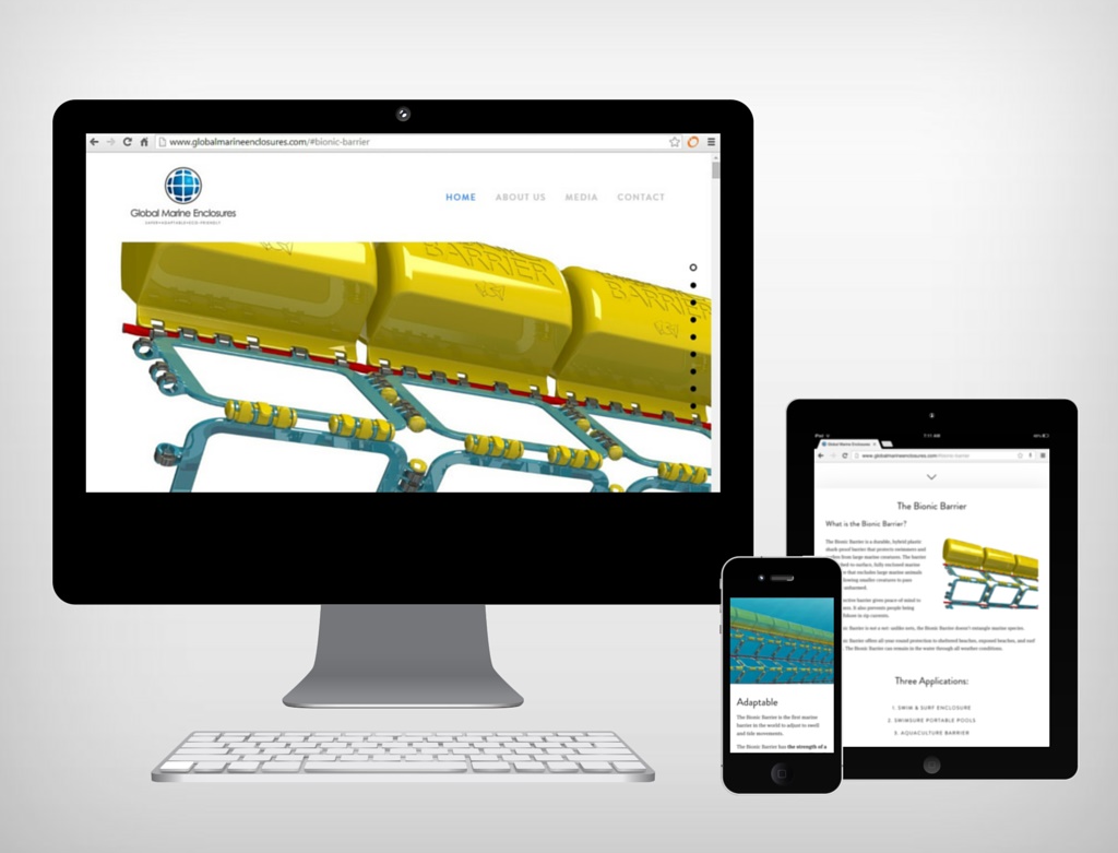
The aim of this project was to create a new brand for the start-up company Global Marine Enclosures through logo design, based on the company’s values of delivering safe marine environments through unique barrier technology. The project involved designing a website that was modern, sleek, and demonstrated the potential of the technology.